How to Create a Gallery Wall: A Complete Room-by-Room Guide

How to Create a Gallery Wall: A Complete Room-by-Room Guide
A gallery wall transforms a blank wall into a curated story it turns empty space into a focal point that reflects your personality, travels, and memories. The best part? You don't need museum-quality pieces or a professional designer to pull it off. What makes a gallery wall work is thoughtful layout, consistent spacing, and a cohesive thread that ties everything together, whether that's a shared color palette, frame finish, or theme.
This guide walks you through every step of creating a gallery wall, from selecting and arranging your pieces to hanging them properly so they stay level and look intentional. Whether you're working with family photos, thrifted art, or a mix of both, you'll find practical tips that work in any room of your home.
Why Gallery Walls Work (and When They Don't)
Gallery walls have become one of the most popular ways to add personality and interest to a blank wall. From sophisticated dining room displays to bright artworks hung above a sofa, to retro prints following you up the stairs, they bring life to spaces that would otherwise feel empty. The beauty of gallery walls is their uniqueness there are no strict rules, just guidelines that help you achieve the look you're going for.
What makes them fail, according to interior designers, is rushing the planning process. Winging it rarely works with gallery walls because spacing inconsistencies become immediately visible, and without a unifying element, the arrangement can feel chaotic rather than curated. The difference between a gallery wall that looks professionally designed and one that looks like random frames on a wall comes down to preparation and intentionality.
Gallery Wall Styles and Layouts
Understanding the different gallery wall layouts helps you choose one that fits your space, your collection, and your aesthetic. Each style has its own visual impact and works better with certain types of collections.
Grid Layout
A grid layout uses all same-size frames arranged in perfect rows and columns. This creates a modern, organized impact that works exceptionally well in contemporary spaces. Grid layouts pair particularly well with black-and-white photography or minimalist art where the consistency of the frames becomes part of the visual statement. The uniformity makes this style forgiving for beginners, but it requires precise spacing to look right.
Salon-Style Layout
Inspired by traditional art galleries, salon-style arrangements mix different sizes and orientations think A4, A3, and A2 frames hung together in a dynamic, layered composition. This approach feels more artistic and collected, perfect for showcasing an eclectic mix of pieces you've gathered over time. The key to making salon-style work is maintaining consistent spacing while allowing the sizes to create visual interest.
Symmetrical Layout
A symmetrical gallery wall mirrors elements on either side of a central piece or invisible center line. This creates a formal, polished look that works well above dining room tables, beds, or fireplace mantels. Symmetrical arrangements are easier to plan because you can work from the center outward, but they require pieces that balance each other in size and visual weight.
Eclectic or Organic Layout
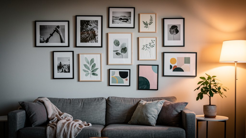
For those who prefer a more relaxed, collected-over-time feel, eclectic layouts allow for mixing frame styles, sizes, colors, and art types. This approach works best when there's an underlying cohesion perhaps a shared color palette running through otherwise unrelated pieces, or a consistent frame finish. Eclectic gallery walls feel the most personal but require the most careful curation to avoid looking messy.
Step-by-Step: How to Create a Gallery Wall
Creating a gallery wall follows a clear process that minimizes mistakes and ensures the final result looks intentional. Here's how to do it right, from start to finish.
- Define your purpose. Decide what you're hoping to achieve with your gallery wall. Are you displaying a collection of favorite artworks, creating a sentimental feature with photos and keepsakes, or filling a bare wall that needs personality? Going in with a purpose guides every subsequent decision.
- Curate more pieces than you need. Pull together more artwork, photos, and frames than you think you'll use. A good gallery wall has variety in sizes, orientations, and media, but it needs a cohesive element that pulls the collection together a shared color palette, subject matter, coordinated frame finish, or consistent mat color.
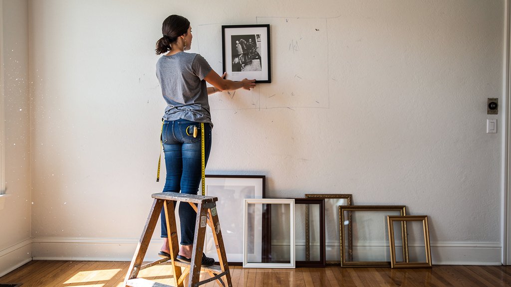
- Create a template on the floor. Lay all your frames out on the floor first to figure out your layout and determine how much space you want between frames. This lets you experiment without making holes in your wall.
- Map it to the wall with paper. Cut paper templates matching each frame's size and tape them to the wall. This step is crucial because it lets you visualize the final result and adjust the arrangement before committing with nails.
- Maintain consistent spacing. Professional designers consistently recommend keeping frames 2-3 inches apart. This ensures one frame isn't overcrowding another, nor are they so far apart that you lose the "one piece of art" effect. Use spacers or a measuring tool to maintain uniformity.
- Hang from the center outward. Start with your largest or most central piece and work outward. This anchors the arrangement and makes it easier to build a balanced composition around a focal point.
- Level as you go. Use a level and measuring tape to ensure even spacing and alignment. A laser level saves time and ensures accuracy across multiple pieces.
Essential Spacing Rules and Measurements
Spacing is where many gallery walls go wrong, and it's also the element that most clearly separates amateur attempts from professional-looking results. The standard recommendation from interior designers is to keep frames 2-3 inches (5-7 cm) apart. This distance is close enough that the pieces feel connected as a unified composition but far enough apart that each piece retains its individual identity.
When placing a gallery wall above furniture, measure from the lowest frame, treating the gallery as one cohesive unit. The entire arrangement should cover approximately two-thirds the width of the furniture beneath it this is known as the 2/3 rule in interior design. For hanging height, aim for the center of the gallery arrangement to fall around 57-60 inches from the floor, which typically means placing frames 8-12 inches above a sofa back or mantel.
"When we create gallery walls for clients, we focus on a few key elements: spacing, frame sizes and colors, and the artwork itself. The spacing is what really makes or breaks the look inconsistent gaps are the most common mistake we see." Apartment Therapy design team
Uneven gaps can make even well-chosen frames look disconnected. If you're working with a salon-style layout with varied frame sizes, the spacing rule becomes more flexible, but maintaining consistency within clusters of similar-sized frames helps maintain visual harmony.
Best Practices and Expert Tips
Interior designers who install gallery walls professionally follow certain principles that ensure consistently good results. Here's what the pros know that most DIYers don't:
- Start with your biggest piece first and build around it. Place your largest frame in one of the four outer corners of your intended arrangement, then fill in around it.
- Use a consistent frame color or finish to tie disparate pieces together, even if the art inside varies dramatically in style and subject matter.
- Consider the wall color gallery walls pop against both light and dark walls, but the framing should complement the existing palette.
- Don't limit yourself to photos only. Incorporate mirrors, textile art, three-dimensional objects, or even plates to add depth and interest.
- Leave some negative space. A crowded gallery wall feels chaotic; intentional breathing room makes the arrangement feel curated and deliberate.
- Think beyond the living room. Staircase walls, hallways, bedrooms, and bathrooms all benefit from gallery wall treatments.
One thing many people overlook is lighting. Direct sunlight can fade artwork over time, so consider placing your gallery wall away from intense natural light sources, or use UV-protective glass in your frames if the wall receives significant sun.
Common Mistakes and Misconceptions
Even experienced decorators fall into these traps when creating gallery walls. Knowing what to avoid saves you from frustration and wasted money on frames you can't return.
Mistake #1: Not planning and jumping straight to hanging. The most common error is trying to arrange frames directly on the wall without first mapping out the layout. This leads to uneven spacing, misalignment, and unnecessary holes in your wall. Always template first.
Mistake #2: Inconsistent spacing. As designers repeatedly emphasize, inconsistent spacing is the telltale sign of an amateur gallery wall. Use 2-3 inch gaps consistently, and measure between each frame as you hang.
Mistake #3: No unifying element. A collection of random frames with no connection looks like clutter, not a gallery. You need at least one thread that ties pieces together color, theme, frame style, or mat color.
Mistake #4: Hanging too high. Gallery walls hung too high is perhaps the most widespread mistake. The center of your arrangement should be at eye level (around 57-60 inches from the floor), not near the ceiling. When placed above furniture, leave 8-12 inches between the top of the furniture and the bottom frame.
Mistake #5: Using all the same frames. While matching frames create a clean, modern look, using identical frames for everything can feel sterile. Mixing frame widths, finishes, or ages adds character and makes the collection feel more collected over time.
A common misconception is that you need expensive, high-end art to create a striking gallery wall. In reality, thrift store finds, family photographs, postcards, and even children's artwork can create a compelling gallery when thoughtfully arranged. What matters most is the curation and presentation, not the monetary value of the pieces.
Frequently Asked Questions
How do I plan a gallery wall layout without making holes in the wall?
The best approach is to lay all your frames out on the floor first to test different arrangements. Once you find a layout you like, create paper templates matching each frame's dimensions, tape them to the wall, and step back to evaluate. This lets you move pieces around and adjust spacing without any commitment. Most professional designers consider this step essential skipping it is the single biggest source of gallery wall regret.
What is the ideal spacing between frames in a gallery wall?
Interior designers consistently recommend 2-3 inches (5-7 cm) between frames. This distance is close enough that pieces feel connected but far enough apart that each retains its individual presence. Gaps wider than 4-6 inches cause the eye to perceive the frames as separate, unrelated pieces rather than a cohesive composition.
Should all frames in a gallery wall match?
Not necessarily. Matching frames create a clean, modern look, but they can also feel sterile. Many designers prefer mixing frame styles, finishes, and even sizes while maintaining cohesion through a shared color palette, subject matter, or mat color. The key is having at least one unifying element without it, the arrangement looks like random clutter.
How high should I hang a gallery wall?
Aim for the center of your gallery arrangement to sit at approximately 57-60 inches from the floor, which is roughly eye level for most adults. When hanging above furniture like a sofa or mantel, leave 8-12 inches between the top of the furniture and the bottom edge of your lowest frame. This creates visual breathing room and ensures the gallery feels connected to the furniture below rather than floating independently.
Can I create a gallery wall with different size frames?
Absolutely. Salon-style gallery walls specifically embrace varied frame sizes to create dynamic, artistic arrangements. The key is maintaining consistent spacing (2-3 inches) and ensuring the varied sizes balance each other visually. Place larger frames toward the center or bottom of the arrangement and smaller pieces around the edges to create a balanced composition.
What if I don't have enough art to fill a gallery wall?
Start with what you have and build gradually. Many people create gallery walls over time, adding pieces as they find them at thrift stores, flea markets, or during travels. You can also incorporate non-traditional items: mirrors, decorative plates, textile art, vintage maps, or even framed botanicals. Another option is using printable art, which is affordable and available in countless styles.
How do I create a gallery wall on a small wall?
Scale down rather than condensing. Use smaller frames and keep the overall width proportional to the wall. A mini gallery wall above a desk or in a hallway can use 4-6 small frames (5x7 or 8x10) rather than the large-scale arrangements you see in living rooms. Just maintain the 2-3 inch spacing rule it applies at every scale.
Key Takeaways
- Plan before you hang use paper templates on the wall to visualize and adjust your layout before making any holes.
- Maintain consistent 2-3 inch spacing between frames for a professional, cohesive look.
- Include at least one unifying element: shared color palette, frame finish, theme, or mat color.
- Start with your largest or most central piece and work outward for balanced composition.
- Hang at eye level (57-60 inches from floor) or 8-12 inches above furniture for proper proportion.
- Don't limit yourself to art incorporate mirrors, photos, textiles, and three-dimensional objects for added interest.
- Build your gallery gradually over time rather than trying to fill everything at once.